# Vue.js
This chapter is about Vue.js (opens new window), the single-page application framework used for AsTeRICS Grid.
# General
In AsTeRICS Grid Vue.js (opens new window) is used in order to manage views and it’s elements in components and to create all kinds of interactivity in the UI. In Vue.js components can be organized in single .vue files, containing the HTML, Javascript and CSS needed for this component. These files are called single-file-components (SFC). These are the files and folders that are important regarding the usage of Vue.js:
- src/vue-components (opens new window): contains all Vue.js single-file components (
.vuefiles) - index.html (opens new window): contains the HTML for the main Vue wrapper component consisting of the navigation sidebar and a placeholder for the currently show view
- src/js/vue/mainVue.js (opens new window): Javascript part for the main Vue component in
index.html - src/js/vue/vuePluginManager.js (opens new window): defines custom Vue directives and filters that can be used globally, e.g. a translate filter.
# Component structure
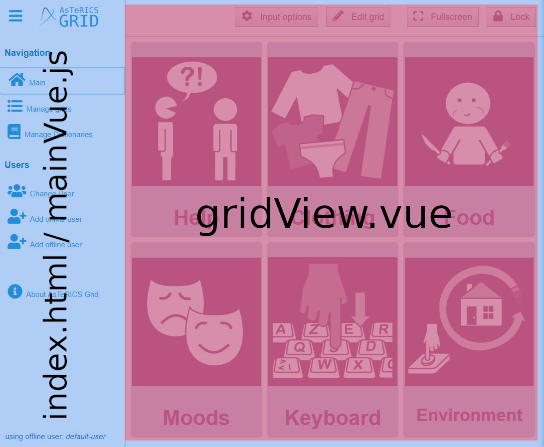
The main Vue wrapper component is defined in index.html (opens new window) and mainVue.js (opens new window). This line in index.html is a placeholder for the currently shown view of the application:
<component v-if="component" v-bind:is="component" v-bind="properties" :key="componentKey"></component>
The method MainVue.setViewComponent() (opens new window) is used in order to change the currently shown view. This method is primarily used by router.js (opens new window) which chooses the correct view based on the current URL hash (opens new window) in the address. For instance https://grid.asterics.eu/#grids has the hash #grids and therefore will render the manage grids component which is defined in file manageGridsView.vue (opens new window).
Figure 1 highlights the Vue.js components that are used for the main view:
 Fig. 1: Vue component structure of the main view, red part (right) is replaced depending on the current navigation
# Used components
The used Vue components can be found in the folder src/vue-components (opens new window) which contains the following folders:
- components: generic components that can be used in various places across the application, for instance:
- accordion.vue: accordion component showing some collapsable content
- comparisonComponent.vue: accordion component showing a comparison between online and offline users (information only)
- headerIcon.vue: component used in the header of different views which shows a hamburger menu and the AsTeRICS Grid logo
- inputEventList.vue: subcomponent for input options, see folder
vue-components/modals/input. - media-list.vue: a generic list of media elements, used for web-radios and podcasts
- nav-tabs.vue: a generic component for navigation tabs, used in modal for editing elements and in settings
- notificationBar.vue: notification bubble at the bottom right, used for app notifications
- searchBar.vue: generic search bar, used in various places
- grid-display: components that use components of library
vue-css-grid-layoutfor the context of AsTeRICS Grid:- appGridDisplay.vue: component representing a whole grid containing several elements
- appGridElement.vue: component representing a generic single grid element
- grid-elements: folder containing components for all types of elements, e.g. normal elements, collect elements, live elements, etc. Also see Element types in “Terms”.
- grid-layout: components of library
vue-css-grid-layout, see last chapter about Grid layout - modals: contains all kinds of modals (popup dialogs), for instance:
- editElement.vue: modal for editing a grid element. The files
editElement[TAB].vueare subcomponents for the tabs in the edit modal, e.g.editElementActions.vue. - addMultipleModal.vue: modal for importing multiple new grid elements at once, used in edit view
- importDictionaryModal.vue: modal for importing new words to a dictionary, see chapter Dictionaries in user documentation
- input: folder for all modals about input options, see chapter Input Options in user documentation
- editElement.vue: modal for editing a grid element. The files
- views: contains different views which are rendered into the component placeholder described in component structure:
- aboutView.vue: view containing general information about AsTeRICS Grid
- addOfflineView.vue: see Offline users
- dictionariesView.vue: see Manage dictionaries view
- gridEditView.vue: see Edit view
- gridView.vue: see Main view
- loginView.vue: see Change user view
- manageGridsView.vue: see Manage grids view
- registerView.vue: see Online users
- welcomeView.vue: see
For general information about the structure and usage of Vue.js components, see the official documentation, for instance Component Basics (opens new window).
← 03 Grid 05 Datamodel →